KIOSK
Category
KIOSK - POS
/
A self-service ordering experience built for speed, clarity, and convenience.

Background
As dining habits shift toward speed and convenience, many restaurants are adopting self-ordering systems to improve efficiency and reduce operational strain. However, not all implementations deliver a smooth experience. Poorly structured interfaces, unclear navigation, and confusing customization flows often create friction instead of solving it.
IDEKIOSK was designed in response to these challenges. The project focuses on rethinking the self-ordering experience from the user’s perspective by prioritizing clarity, speed, and ease of use. By simplifying interactions and leveraging visual cues, the system aims to support both customers and restaurant operations in a more seamless and scalable way.
Problem Statement
Long queues during peak hours
Menu is hard to scan and not visually engaging
Order mistakes due to miscommunication
Goal
Design an ordering experience that is efficient, intuitive, and seamlessly guides users from start-to-end process with minimal effort.
Design Process
Research & Insights
To make sure the design was grounded in what actually works, I looked at how existing self-ordering kiosks and food delivery apps handle things such as McDonald's Kiosk, KFC Self-Order, GrabFood, and GoFood. I wanted to understand how these products guide users through ordering, present their menus, and deal with customization.
Problem Definition
Based on the benchmarking, I identified a recurring gap between efficiency and clarity in existing self-ordering experiences. While many platforms successfully optimize for speed through visual menus and simplified flows, they often introduce friction in key moments, especially within product detail and customization.
And then i defined the core problem as:

User Flow
I designed a user flow that is intentionally simple, linear, and easy to follow. I wanted to make sure users always had a clear next step, without needing to think through multiple paths or decisions.

Wireframing
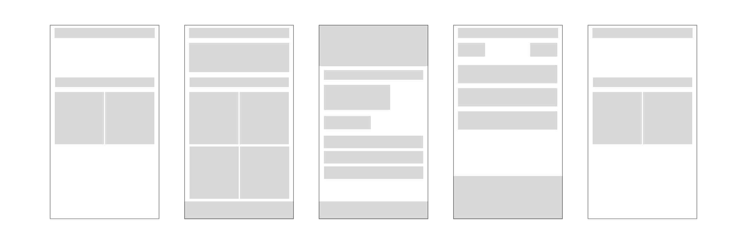
Wireframes were created to establish structure and layout before visual styling.
Final Design
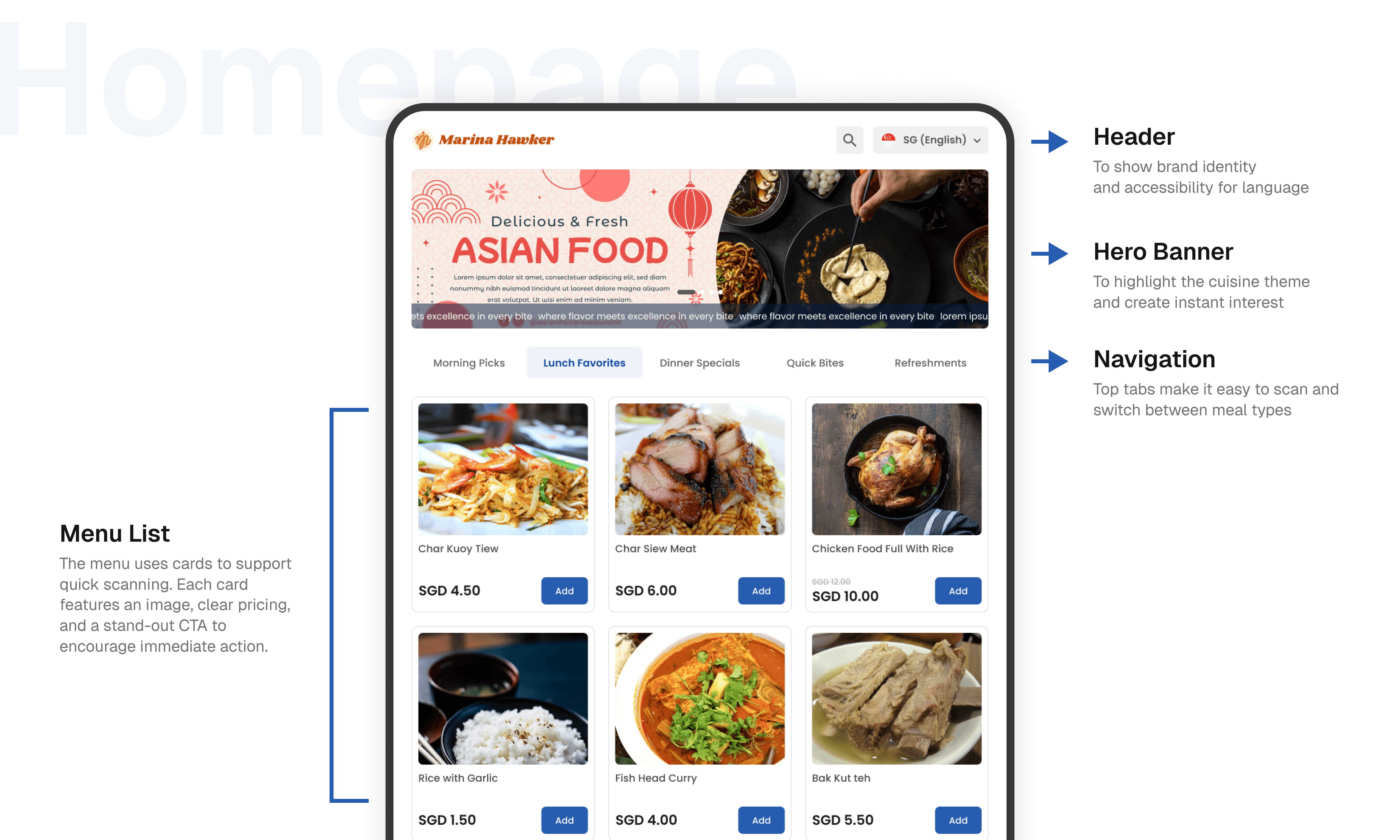
Scannable Menu on Homepage
The menu is built around visuals first, making it easy for users to scan and recognize items without having to read much. I kept the name and price short and straightforward, just enough information to move someone from browsing to deciding without slowing them down.
I also added a cart summary that users can access directly from the page, so they can quickly review, remove, or edit items they’ve already selected without needing to switch screens.
For the main actions, I placed the checkout and cancel buttons at the bottom of the screen. This keeps them easy to reach when needed, while making sure they don’t interfere with the main browsing experience.

Structured Detail Page
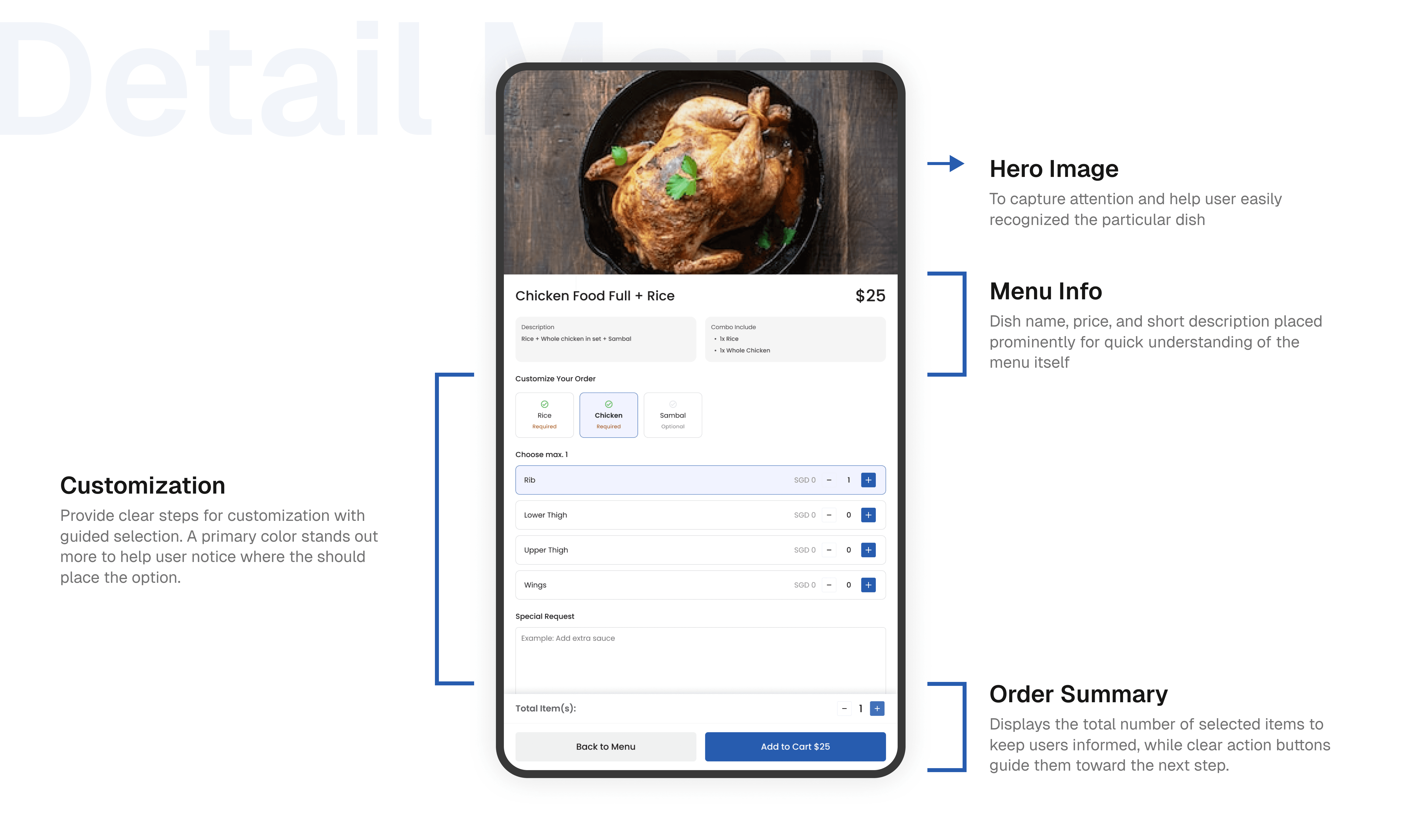
Each product page follows the same structure every time: item details first, then combo options, then customization. Breaking it down this way keeps things from feeling overwhelming and makes it easier for users to work through their choices one step at a time.
This page gives customer everything they need to know about an item in one place. They can see how it looks, read a quick description, check if there are any combo or package deals, and then decide how they want to customize it before adding it to their order.
Checkout Page
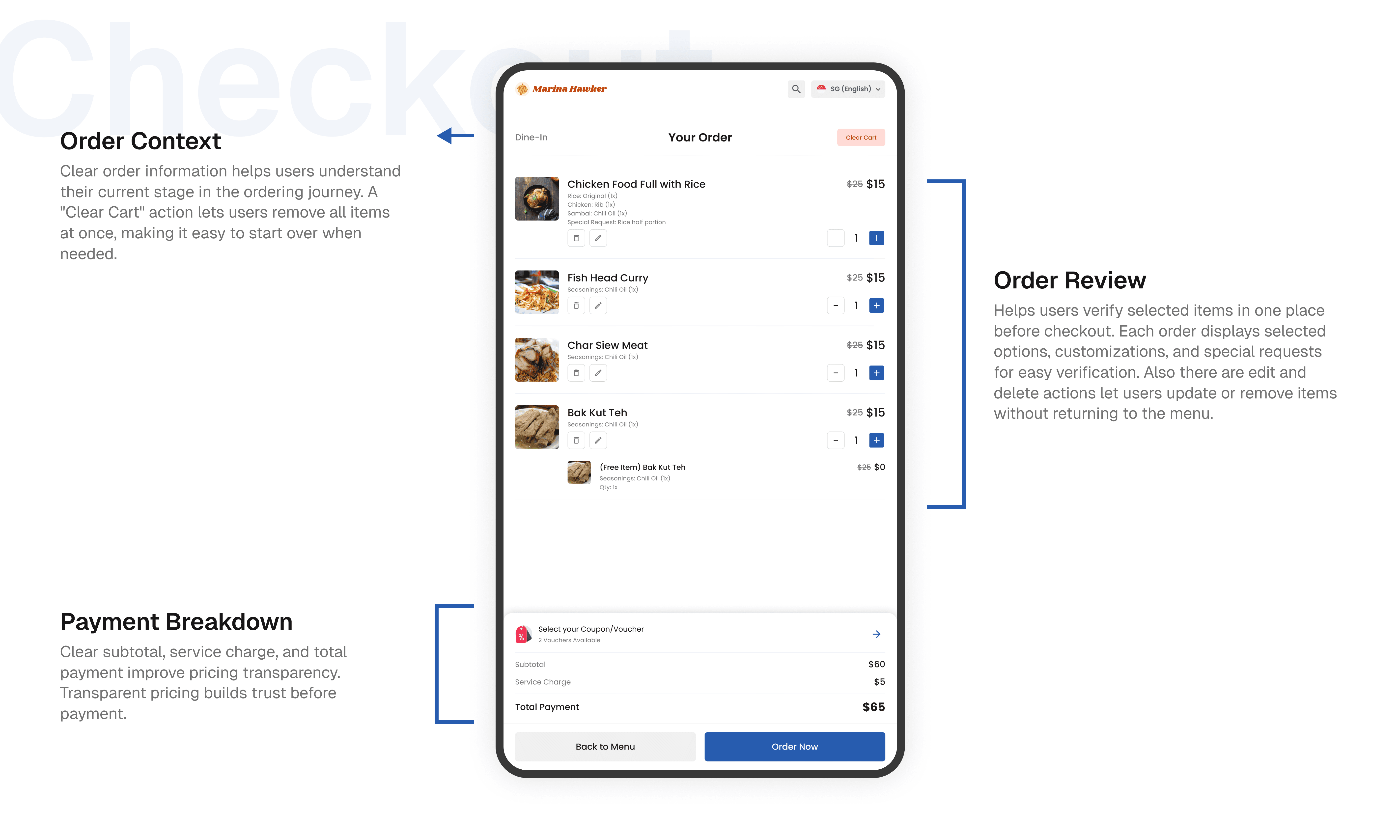
The cart page gives customer a clear overview of everything they've added before they commit to placing an order. Each item is displayed with its image, name, selected customizations, and price, making it easy to review the order at a glance. Customer can adjust quantities, edit their choices, or remove items directly from this screen without having to go back and forth.
Towards the bottom, I included a coupon and voucher section so users can apply discounts in one place, along with a loyalty points toggle for redeeming rewards. The cost breakdown is laid out transparently, showing the subtotal, discounts, service charge, and total, so users know exactly what they're paying before hitting Order Now.
First Launch
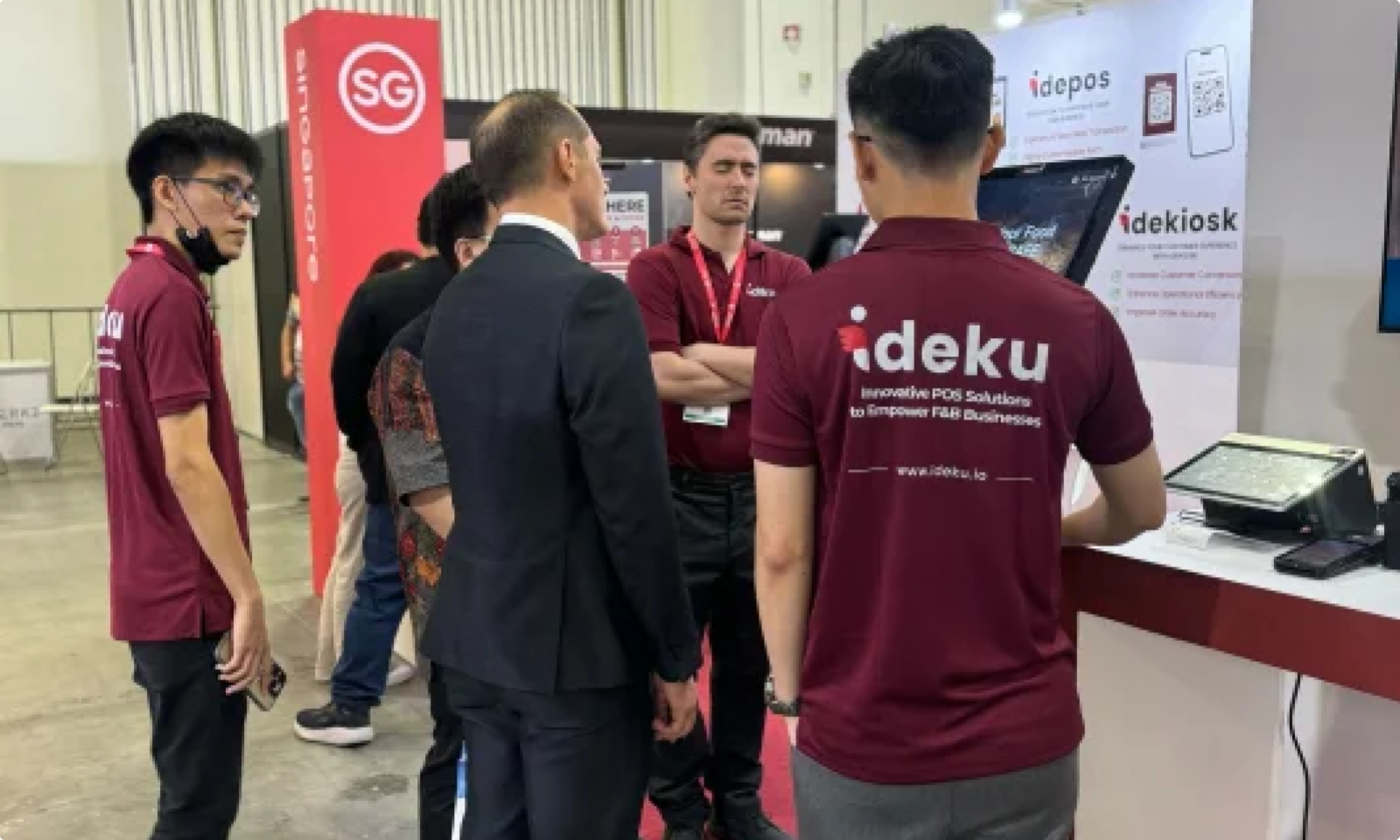
The IDEKIOSK are first introduced in the Restaurant Asia exhibition held on 26-28 June 2024 in Singapore. Based on the outcomes of the exhibition, it is evident that numerous comments regarding both functionality and aesthetic appeal should be incorporated into future designs.
This app also can be found on Google Play Store! (Available from desktop/tablet).